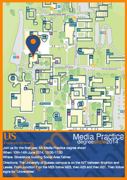
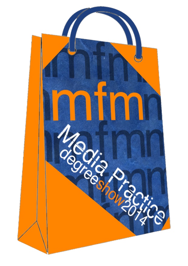
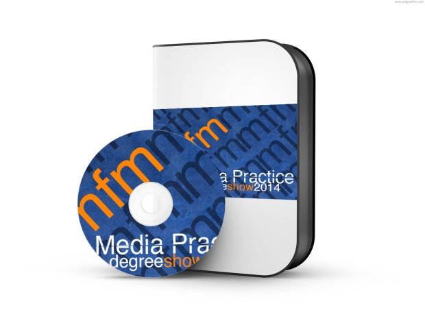
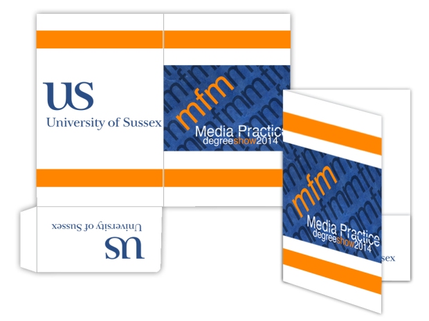
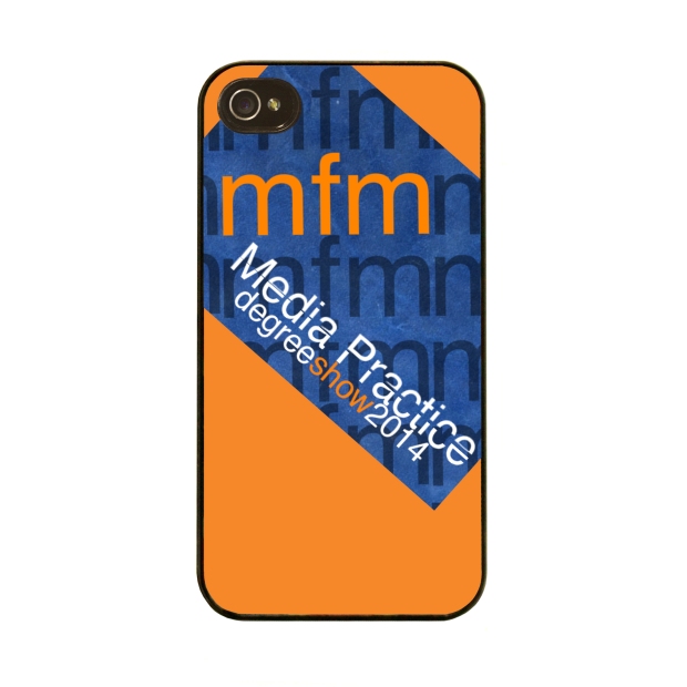
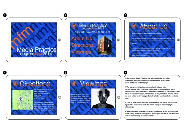
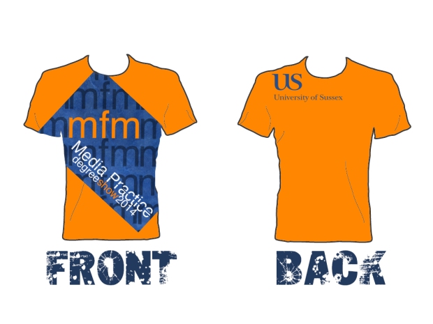
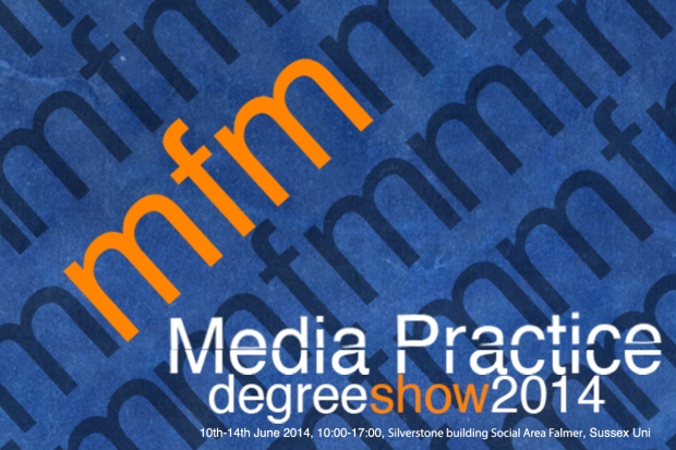
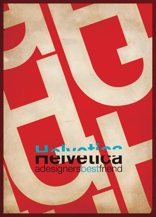
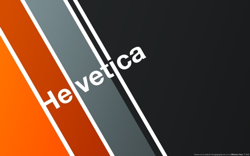
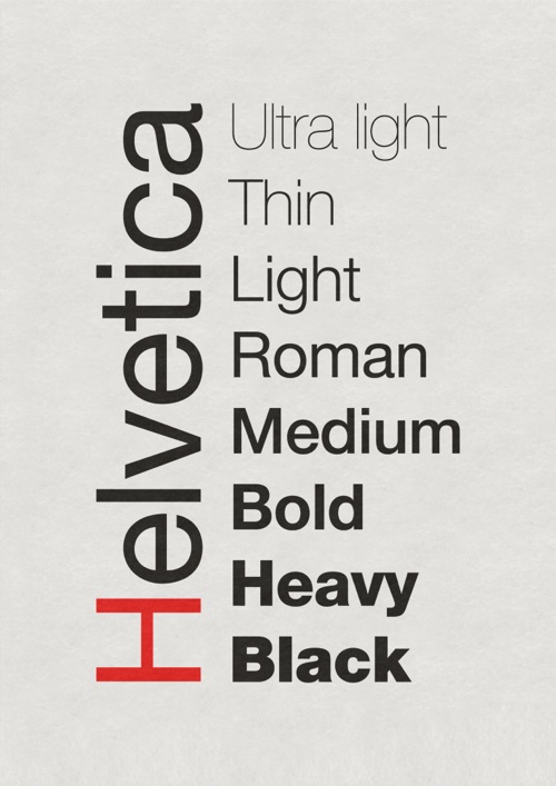
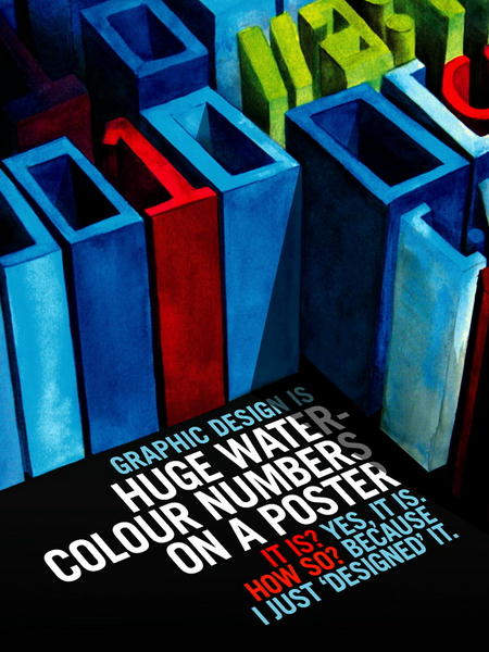
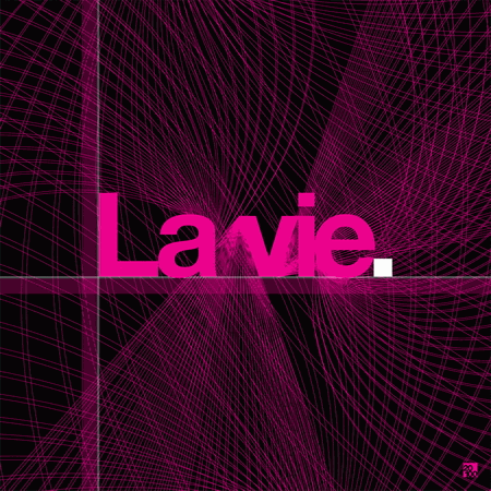
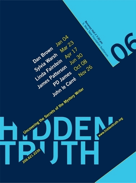
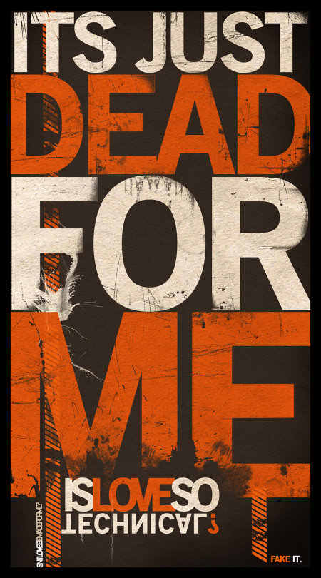
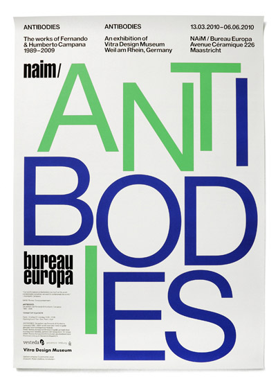
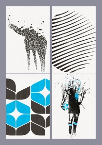
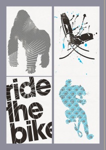
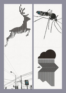
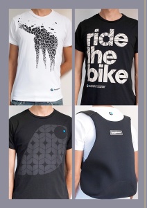
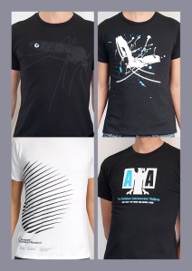
Everything is finally finished! Below are the raw image files for the final year degree show press-package. After completing extensive research on colour choice, layout and typefaces I feel as though I have effectivey achieved what I set out to do.
Choosing Colour

After carrying out extensive research on the choice of colour for my final design I decided to go with orange and blue as they are opposite sides of the spectrum and therefore will produce an aesthetically pleasing ‘clash’.
Here’s an article that explains why! – http://www.apartmenttherapy.com/color-theory-101-making-complementary-colors-work-for-you-179143


Do typefaces matter?
I found a really interesting BBC article about typeography!
Research of ‘Type’ posters
Research into type posters – Experimental Jet Set
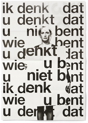
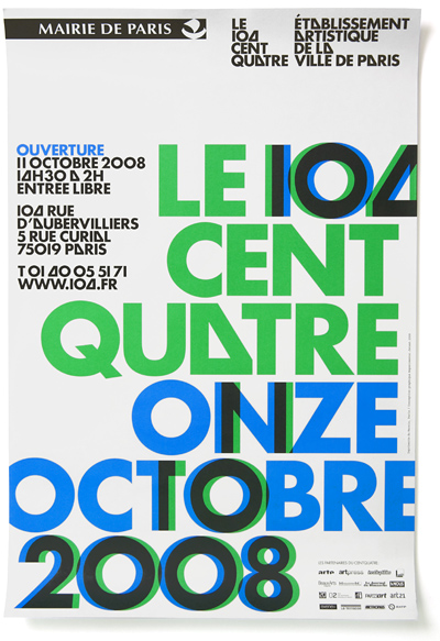
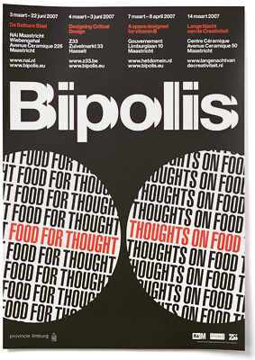
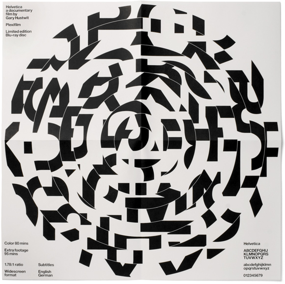
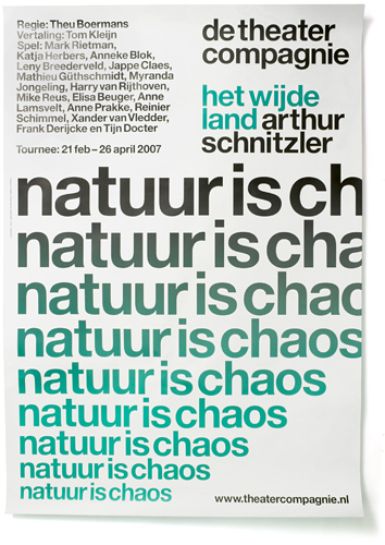
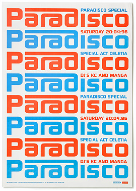
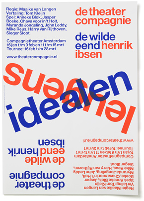
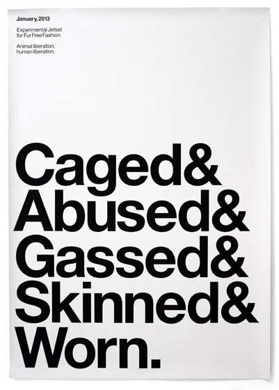
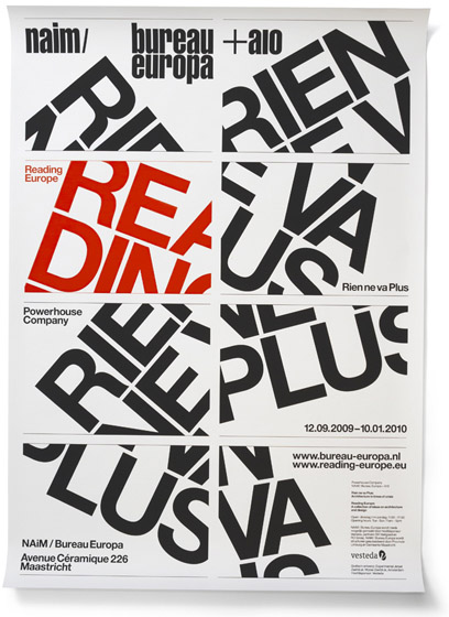
For my final project I have decided to have a simplistic design that primarily incorporates and focusses around type. The Experimental Jet Set designers from Holland have been of particular influence to me due to the minimalist style they use, and I very much like the use of the timeless classic that is the Helvetica typeface. Here are some examples of the styles I liked from them below:
I particularly like when they repeat the same words and lettering over and over and they alter the alignment/positioning on the page to draw greater attention to it. It gives it a more ‘wholesome’ look that I wish to encapsulate. I also like the use of simple colour that does well to create a clash that simultaneously compliments the overall look of the design.
http://www.experimentaljetset.nl/previewhttp://www.experimentaljetset.nl/preview
Cool Design – Breaking Bad Posters!
During the many hours of procrastination whilst attempting to do some work I came across something very cool! Someone who is probably far less likely to get as distracted as me has taken it upon himself to create a poster for every single Breaking Bad episode! I really like the simplistic and ‘clean’ design used to recreate some of the series’ most iconic moments, and it is particularly reminiscent of the simplistic style often incorporated by Penguin books.
Here’s the link to his other awesome work!
David Carson Presentation
A pioneer in new wave graphic design during the 1990s, Carson believed in putting his emotion into design and maintained that the way text was presented held the same level of importance as the content itself. I found his apporoach to design to be very refreshing and unique as it draws the spectator into a piece of work – something I will definitely take into consideration during my final project. Below is the Prezi link and the notes from my presentation:
http://prezi.com/lju0fe_913fp/david-carson/
David Carson Presentation notes
Ray gun
- Carson was the founding art director of the American alternative rock-and-roll magazine ‘Ray Gun’ that was first published in 1992
- It explored a chaotic & abstract style of experimental typography that matched its content and was very distinct
- After three years Carson left, but the compelling visuals were still a very large part of the magazine
- Examples:
- Cover – Erratic, chaotic, inconsistent spacing/font/layout, random, words/type is the main focus, “dirty” type(‘unclean’ texture and design to the page), the way the page is desgined forces to look at the art style more than the content first, design of the cover reflects his work method – does what he feels, perhaps reflects his emotions?
- Double page spread – Less “dirty”, again the content kind of takes a back seat to the art style, layout creates curiosity for content, words & layout are still the main focus stylistically
Techniques & reception
- Dingbat font (2.16 YouTube video)– Shows how Carson infuses raw emotion into his work and effectively highlights his boldness to do as he feels when it comes to design
Cultural Impact & Public Opinion
- Carson believed that how written content was presented made a significant impact on how strongly its message was communicated to its readers
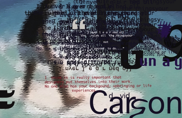
- Example image – visual design effectively communicates monotony of what’s being said – i.e. we know it is being repeated over and over, and the way the words weave in between his head, and the different sized and scattered font also drill in the message to the audience
- Many people rejected the magazine due to the illegibility of the text, therefore only catering to a specific kind of audience
- Post 90s era there was a boredom in the Helvetica typeface – people were more readily accepting of new and abstract designs, and therefore fully embraced Carson’s style of typography
- Carson only ever attended 2 graphic design classes before he became a designer. Therefore he was not restricted by old-fashioned styles, which allowed for an uninhibited ‘raw’ quality to be brought to his work, and his emphasis on emotions made his work relatable.
[#2] InDesign Task 2 – Five Squares Ten Inches
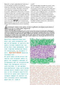
Using InDesign I arranged five square/rectangle boxes inside a ten inch grid that (I hope!) have achieved compositional balance, tension and depth:
I included a variety of different type styles, which ranged from old style italic serifs to more geometric slab serifs. To create a unique contrast between the text boxes I decided to drastically alter each layer of text to make them a lot more distinct. The formatting of each was different, which included differing text flows, font sizes, colour, leading and kerning of text. Words within each text box were individually altered (i.e. words made larger and bold) to highlight them as well as changing their colour. The box on the mid-right hand side of the page is purposefully illegible in order to create a sort of desired artistic effect. Similarly the bottom right text box includes larger fonts which increased spacing, and bleeds out of the page rto reinforce the illusion of amplification and recession.
[#1] InDesign task 1 complete!
[#1] Research for InDesign task

Whilst undergoing a spot of research for the first homework task of the year (yaaaaay #sarcasm) I came across a few interesting and inspirational images. I firstly decided to search things I’m into – i.e. games (mass effect), music (Red Hot Chili Peppers,) and films (Matrix etc). However I soon realised that this was not a great way to go as there are only a handful of so called ‘inspirational’ design associated with these. I therefore took it upon myself to actually search ‘good design’ into Google (my best friend) and lo and behold, I came across some great results! Here’s the best laid out site:
It includes a plethora of really cool images, and I was particularly drawn to a kind of simplistic style framework that came together to produce something with a degree of complexity in the Santa Monica brand below:
http://www.santamonicabcn.com/print/
Looks like I found what I’ll be putting in my InDesign inspiration list! I think… you can be inspired in a ridiculously short space of time, right?
