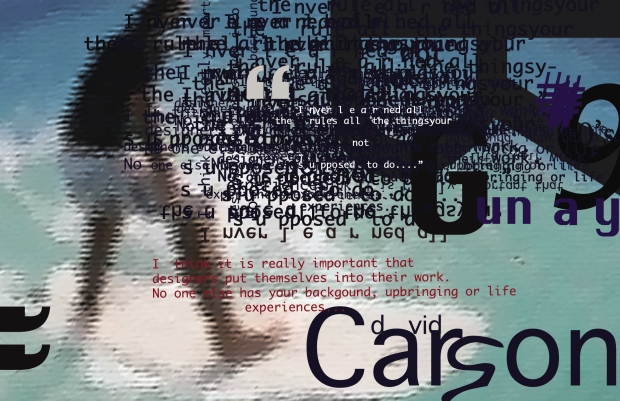
A pioneer in new wave graphic design during the 1990s, Carson believed in putting his emotion into design and maintained that the way text was presented held the same level of importance as the content itself. I found his apporoach to design to be very refreshing and unique as it draws the spectator into a piece of work – something I will definitely take into consideration during my final project. Below is the Prezi link and the notes from my presentation:
http://prezi.com/lju0fe_913fp/david-carson/
David Carson Presentation notes
Ray gun
- Carson was the founding art director of the American alternative rock-and-roll magazine ‘Ray Gun’ that was first published in 1992
- It explored a chaotic & abstract style of experimental typography that matched its content and was very distinct
- After three years Carson left, but the compelling visuals were still a very large part of the magazine
- Examples:
- Cover – Erratic, chaotic, inconsistent spacing/font/layout, random, words/type is the main focus, “dirty” type(‘unclean’ texture and design to the page), the way the page is desgined forces to look at the art style more than the content first, design of the cover reflects his work method – does what he feels, perhaps reflects his emotions?
- Double page spread – Less “dirty”, again the content kind of takes a back seat to the art style, layout creates curiosity for content, words & layout are still the main focus stylistically
Techniques & reception
- Dingbat font (2.16 YouTube video)– Shows how Carson infuses raw emotion into his work and effectively highlights his boldness to do as he feels when it comes to design
Cultural Impact & Public Opinion
- Carson believed that how written content was presented made a significant impact on how strongly its message was communicated to its readers
- Example image – visual design effectively communicates monotony of what’s being said – i.e. we know it is being repeated over and over, and the way the words weave in between his head, and the different sized and scattered font also drill in the message to the audience
- Many people rejected the magazine due to the illegibility of the text, therefore only catering to a specific kind of audience
- Post 90s era there was a boredom in the Helvetica typeface – people were more readily accepting of new and abstract designs, and therefore fully embraced Carson’s style of typography
- Carson only ever attended 2 graphic design classes before he became a designer. Therefore he was not restricted by old-fashioned styles, which allowed for an uninhibited ‘raw’ quality to be brought to his work, and his emphasis on emotions made his work relatable.
